My Favorite Custom CSS for Squarespace Courses
I love using Squarespace Courses for my website template launch courses. Everything is in one place on my own website, my courses are easy to use, and I have endless styling flexibility with Squarespace Fluid Engine. But, there are a few custom CSS tweaks I like to make to the course header and sidebar navigation menu in my courses.
Here are the CSS snippets for Squarespace Courses that I cover in this post and you can see them in action in the video below.
Hide Website Header Navigation
Course Lesson Header Styling
Clean Up Sidebar Navigation Thumbnails (make PNG thumbnails transparent and hide video play icon)
Change Sidebar Navigation Toggle Color
Add a Border to the Sidebar Navigation
FYI - All of the CSS code in this post can be added to the sitewide CSS Panel.
Shout out to Kerstin Martin who taught me everything I know about Squarespace Courses, and inspired some of this CSS. Kerstin has a new course called Calm Course Creator coming out in February 2026. You can learn more and join her waitlist here.
Hide Website Header Navigation
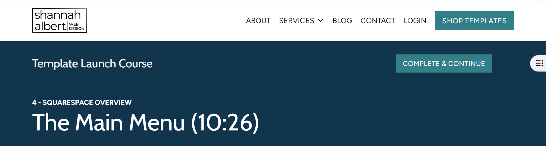
I like to hide most of the website header navigation in courses because students have no need to explore my website when they are taking my course and the navigation is just distracting in the lesson header.
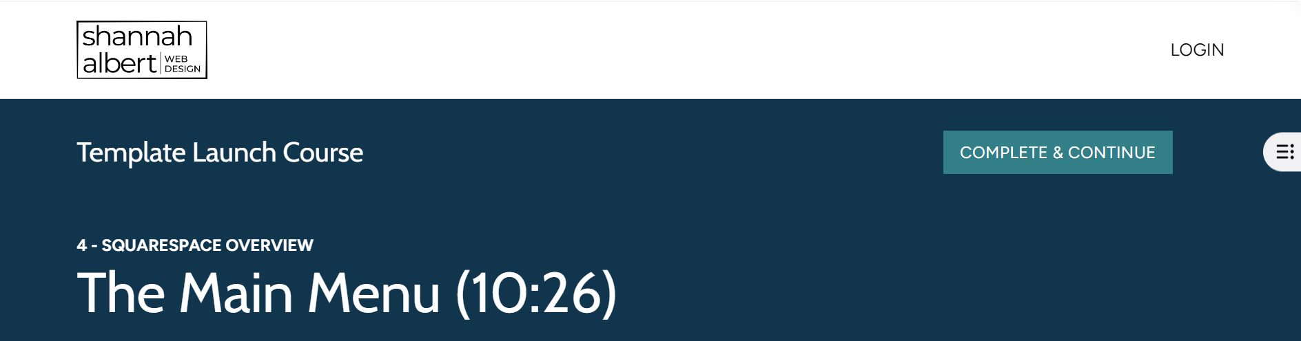
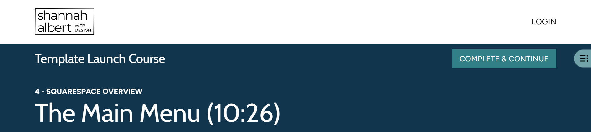
The code snippets below will hide the header navigation items, the shopping cart, and the CTA button in the header on the main course overview and lesson pages. What stays in the header are the website logo and login/account link that students can use to login to the course or manage their account.
I also hide the entire footer on my courses (for the same reason) by toggling “Show Footer” off, in the Course Settings > Navigation panel. I could hide the entire header the same way but because I want to show parts of the header, I need to use CSS.
Here is what my course lesson header looks like without any CSS:
Here is what my course lesson header looks like AFTER the header navigation and button are hidden with CSS:
Here are the CSS code snippets:
The .course-list-section is the main overview page and the .course-item-section is the course lesson page. If you wanted to hide elements on just one of these pages you can remove the other selector from the CSS.
//* COURSE HEADER: HIDE MAIN WEBSITE NAVIGATION (MAIN PAGE & LESSON PAGES)
body:has(.course-list-section, .course-item-section) .header-nav-wrapper {
display: none !important;
}//* COURSE HEADER: HIDE MAIN NAV CTA BUTTON (MAIN PAGE & LESSON PAGES)
body:has(.course-list-section, .course-item-section) .header-actions .header-actions-action--cta {
display: none !important;
}//* COURSE HEADER: HIDE MAIN NAV CART (MAIN PAGE & LESSON PAGES)
body:has(.course-list-section, .course-item-section) .header-actions-action .sqs-custom-cart {
display: none !important;
}
Course Lesson Header Styling
There are two changes I like to make to my course lesson headers:
Add a back arrow and underline the course title at the top of the lesson page so it’s more obvious that if you click on it, you will return to the course overview page.
Add more space (margin) around the “Complete & Continue” button (which adds more space to the entire top row)
Here is what the course lesson header looks like BEFORE the CSS tweaks are applied.
Here is what the course lesson header looks like AFTER the CSS tweaks are applied:
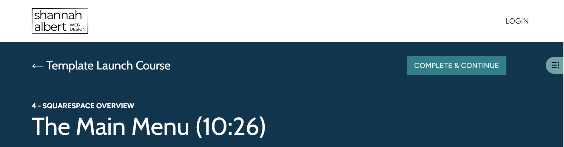
The course title is underlined and there is a back arrow before the title.
There is a little more space above the course title and button
There is a little more space between the button and the sidebar navigation toggle.
There is also more space between the course title and the lesson title but it’s less noticeable because they are all the same color in my header. If you have a border between the course title/button row and the lesson title, the space will be more obvious
Here are the CSS code snippets:
//* LESSON HEADER: ADDS A "BACK ARROW" BEFORE THE COURSE NAME
.course-item__course-title a:before {
content: "← ";
}//* LESSON HEADER: UNDERLINES THE COURSE TITLE NAME AND MAKES THE FONT A LITTLE BIT HEAVIER
.course-item__header .course-item__course-title {
text-decoration: underline; //* adds the underline
text-decoration-thickness:.5px; //* sets the thickness of the underline
text-underline-offset: 10px; //* sets how far the underline is from the text
}You can adjust these variables to change the thickness or offset of the underline.
//* ADD MARGIN AROUND NEXT LESSON HEADER BUTTON
.course-item__header .course-item__next-lesson-button {
margin-top: 20px; //* adds space above the button/course title
margin-bottom: 20px; //* adds space below the button/course title
margin-right: 50px; //* adds space between the button and the toggle
}You can adjust the pixels (px) to add more or less space to any of these margins. You are technically adding the margin around the button but the top/bottom margin impacts the entire row.
Clean Up Sidebar Navigation Thumbnails
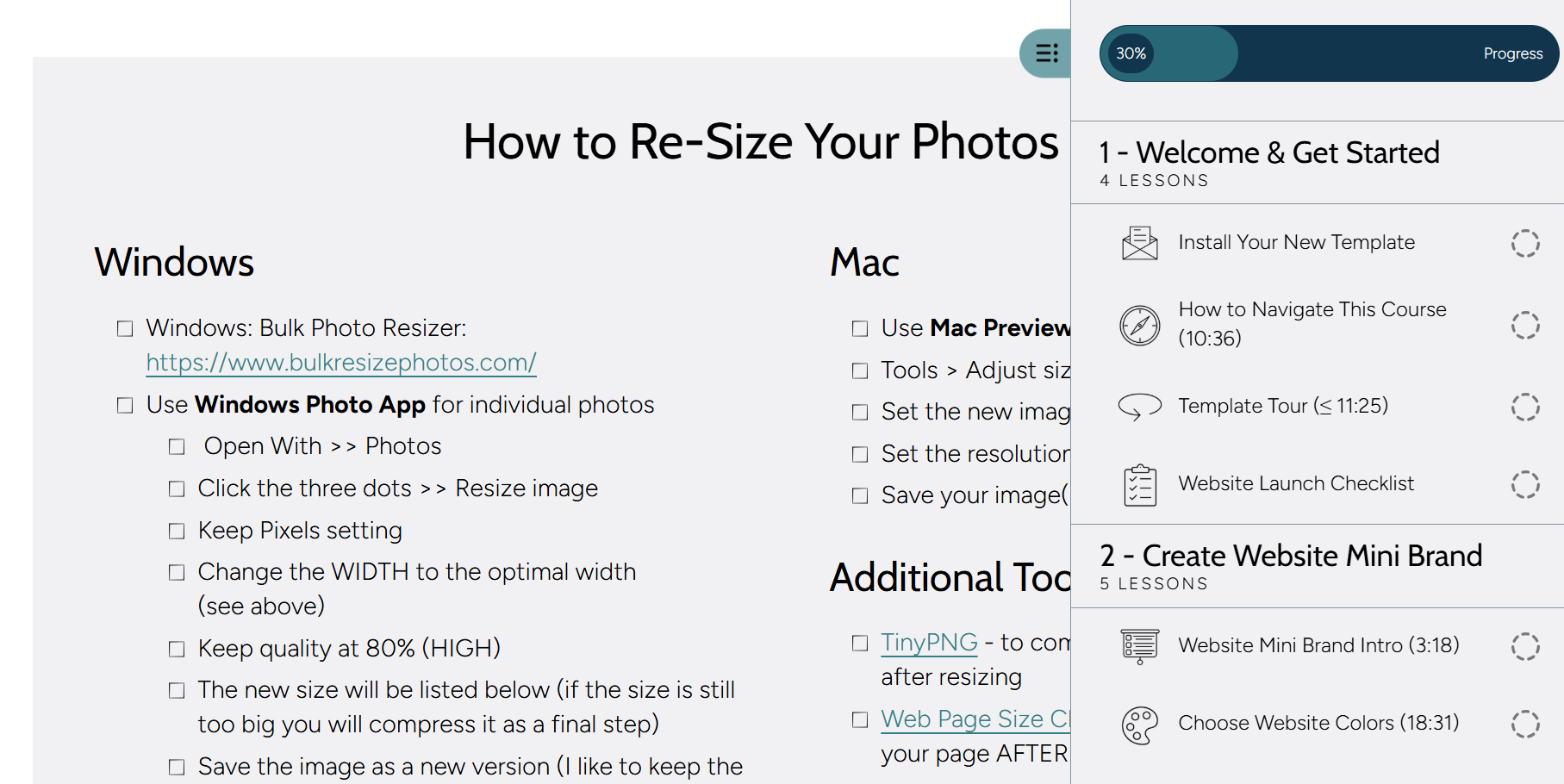
I like to use icons as my course thumbnail images, but the image below shows what they look like without any CSS. The icons are not transparent (even though the PNGs images are) and there is a video play icon on top of my beautiful icons (even when there is no video in the lesson! Why, Squarespace, why????)
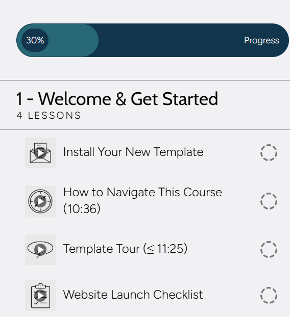
The CSS code snippets below will make the images transparent (as they should be) and remove the video play icon. (Even if you don’t use icons for your thumbnails, you might want to remove just the video play icon.)
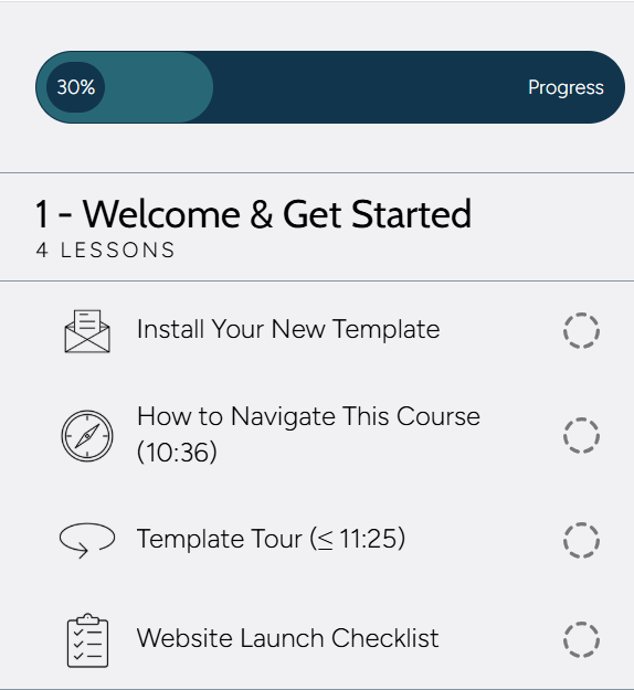
Here is what my sidebar navigation looks like after I apply the CSS:
Here are the CSS code snippets:
//* SIDEBAR NAV: REMOVES VIDEO PLAY BUTTON
.course-item__video-player-icon-container {
display:none
}//* SIDEBAR NAV: MAKES THUMBNAILS TRANSPARENT
.course-item .course-item__side-nav-link .course-item__side-nav-thumbnail-container {
background : transparent;
}
Change Sidebar Navigation Toggle Color
The sidebar navigation toggle (the part that sticks out for people to click on to expand the sidebar navigation) will be the same color as the background of your sidebar BUT depending on the colors you use in your lessons, that toggle can be very hard to see.
For example, when my sidebar navigation toggle is light gray, it is hard to see on my white lesson sections.
The code below will change the toggle to any color you want to use. Here is what mine looks like after I changed the color to a light green.
I recommend using a light-ish color for the toggle so you can still see the menu icon that helps users understand that this is how you can see the menu, just use a color that has strong contrast to all of your lesson sections.
Here is the CSS code snippet:
Replace the hex code with a color that fits your website colors.
//* SIDEBAR NAV: CHANGE TOGGLE COLOR
.course-item .course-item__side-nav-header .course-item__side-nav-toggle-button-desktop {
background: #72A3AA;
}
Add a Border to the Sidebar Navigation
My last tweak adds a border to the side of the sidebar navigation. If the sidebar navigation background color is the same as some of your lesson sections, it can blend into the lesson. A border just distinguishes it a bit more from the rest of the page.
Here is what mine looks like on a section of the same color after I add that border.
Here is the CSS code snippet:
var(--course-item-nav-border-color) is a color variable that automatically sets the color of the border to the same color as “borders” (lines) between the lesson items in the sidebar.
This code assumes your sidebar is on the right side of the screen. If your sidebar is on the left, replace the word left below with right (to put the border on the right).
//* SIDEBAR NAV: ADDS BORDER ON THE LEFT OF NAVIGATION PANEL
.course-item .course-item__side-nav {
border-left: 1px solid var(--course-item-nav-border-color);
}
The Net-Net
Squarespace Courses is a great product that allows you to create and sell beautiful, easy to navigate courses right on your own website. With the CSS code in this post, you can tweak the look and feel of the course header and sidebar navigation to make your courses even better!